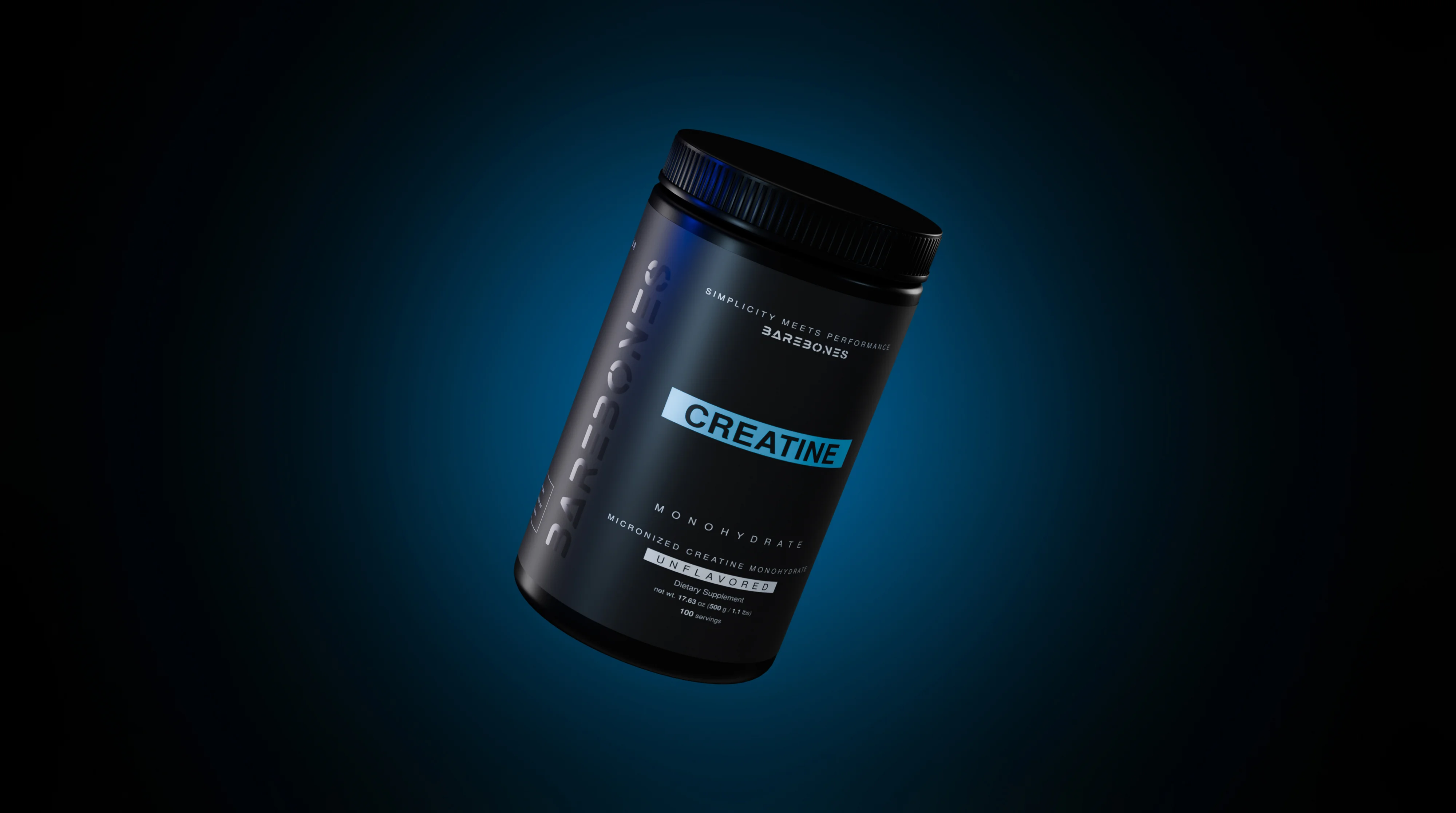
Kinexis Labs
Visual identity development, creative direction and packaging for a men’s vitality supplement brand.
Pieces


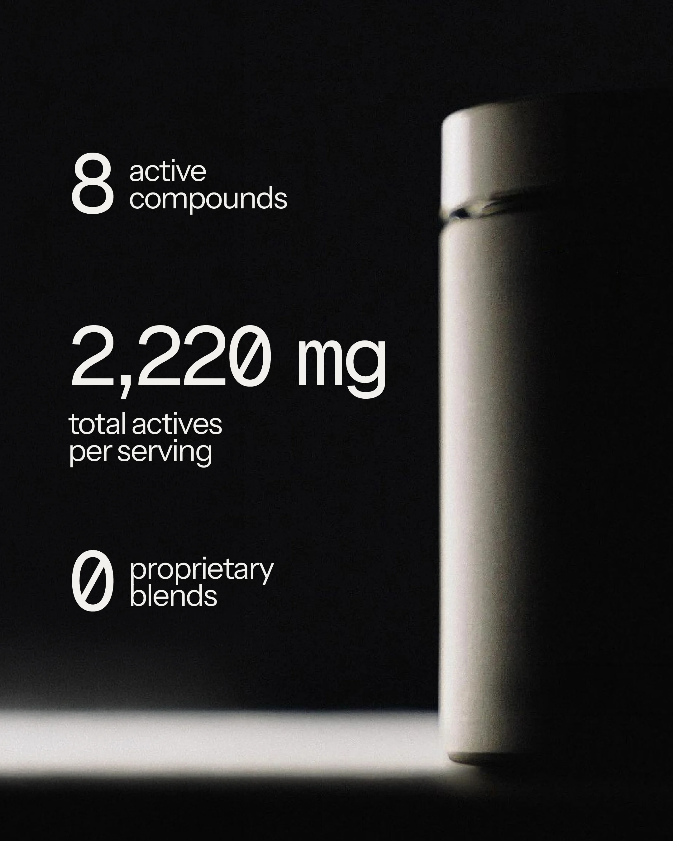
Kinexis Labs is an American supplement brand built on one idea: transparency. Its first product is The Protocol, a daily capsule formula for men’s vitality, made with full doses and no proprietary blends. The brand was starting from scratch, with the packaging as its first point of contact.
Project details(04)
- Year
- 2026
- Role
- Creative direction + graphic design + 3D
- Studio
- errebé.
- Services
- 3D · Render
About the project
The challenge was to build a men’s performance brand without any of its codes: no gym aesthetics, no promises. The positioning called for a clinical, premium register, closer to luxury skincare than to the supplement aisle.
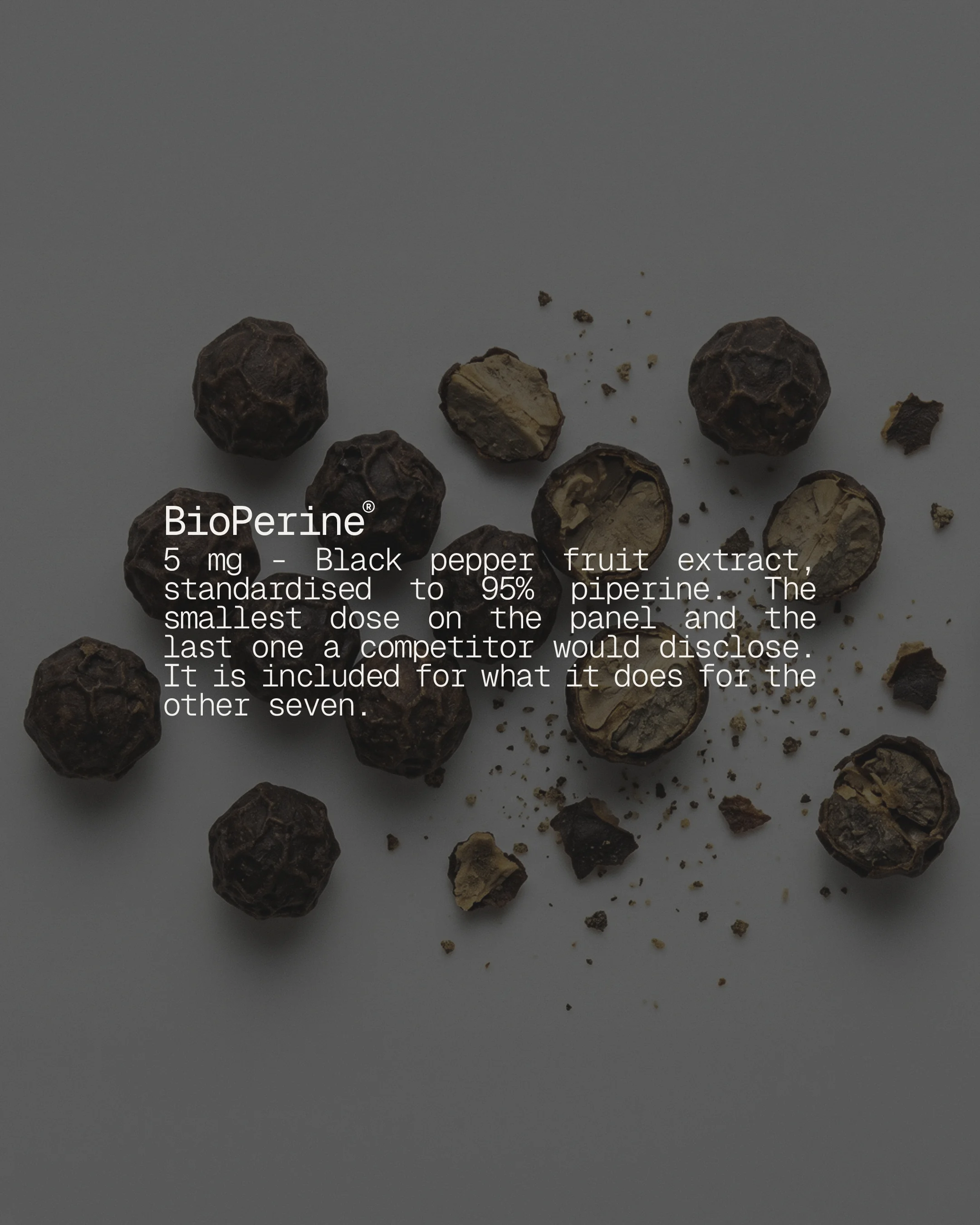
The project was developed end to end: visual identity, creative direction and the packaging system. Visually, a restrained wordmark on a strict Swiss grid, two typefaces with separate jobs — one for the voice, a monospace for the doses — and an almost monochrome palette where the accent is not a color but a finish: gloss varnish on matte black, a logo that only appears when the light grazes it. The system extends to the mailer box, the jar label and the pieces in each shipment.
Graphic pieces(03)
Next project